Read price, then add useful context
HP Price Charts combine candles, drawings and HedgePulse overlays.
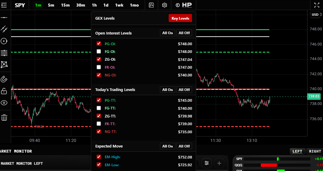
Start with the current range and nearby swing highs and lows. Add only the overlays you need.
Choose a candle timeframe
| Labels | Candle length |
|---|---|
| 1m, 5m, 15m, 30m | One, five, fifteen or thirty minutes |
| 1h | One hour |
| 1d, 1wk, 1mo | One day, week or month |
The selected interval is remembered by symbol. The visible time axis follows the dashboard time-zone setting.
Candle timeframe and expiration scope are different. Timeframe changes the price candles. Scope selects the option expirations behind the exposure view.
Try HP → Key Levels
- Open HP on the chart toolbar.
- Click Key Levels to show or hide the calculated levels.
- Compare price with the nearest PG, ZG and NG.
- Use individual rows when you want fewer lines.
OI and Volume are different calculation bases. Volume is the volume for today’s trading session across all expirations within the selected scope. If the view shows an earlier As of date, use that displayed session.
The HP menu also includes Expected Move references. They estimate a priced range; price can cross either boundary.
Try EXP → Exposure Profile
Open EXP, then use the Exposure Profile toggle. Turn it off and on to see what the profile adds beside price.
Choose the available basis and exposure measure. Compare OI with Volume while keeping the symbol and scope fixed. A profile amount is exposure, not a count of contracts.
The same menu includes HP Level History on intraday timeframes. Its level basis and expiration group are separate controls. Missing history is not a zero level.
Read Market Monitor
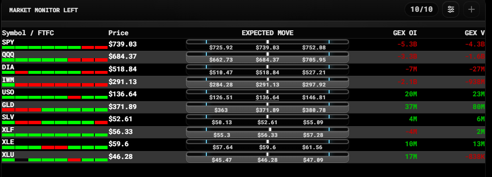
Market Monitor compares symbols in a compact table. In Command Center it appears below the histograms.
The cells beside Symbol / FTFC are:
1m · 5m · 15m · 30m · 60m · D · W · M
These are candle timeframes, from one minute through monthly. Each cell shows its timeframe's STRAT state. Hover for the label. Mixed readings mean the timeframes are not aligned. Decode the STRAT states.
Add a column
Open the monitor's Customize control. Under Exposure Columns, check a metric such as DEX OI. Uncheck it to remove it.
Available columns include GEX, DEX and CEX on OI/Volume bases, plus OptRVOL, FlowImb and UA. Settings also control FTFC and Weekly Expected Move visibility.
The monitor's Expected Move display places price between the shown range references. Use the table to choose a symbol worth inspecting, then read its chart.
Compare sectors over time
Click the center Sector Performance panel or Compare to open its chart. Choose 1M, 3M, 6M, YTD or 1Y, then use the symbol checkboxes to simplify the comparison.
The small panel shows daily percentage changes. The expanded chart shows price change from a shared starting date, with each line starting at 0%. Read the actual coverage dates; missing observations remain gaps. This is price performance, not a return including dividends.
Draw only what helps
Use the left drawing toolbar or right-click menu for levels, ranges and trendlines. Drawings persist by symbol.
Keep candles readable. A calculated level, an aligned timeframe or an indicator is context, not a complete trading decision.